UTSA Icon Library
Whether found online or in print, an icon is an ideogram or pictogram designed to serve as a visual shorthand that helps readers quickly understand a concept.
These symbols need to be simple, graphic, universally comprehensible whenever possible, and — when viewed as an icon set — they need to maintain uniformity by sharing attributes such as size, line width, and color.
The UTSA Icon Library houses a growing collection of commonly-requested icons in a simple, monoline style. These icons are consistent in color, line weight, and negative space, allowing them to work alongside the other icons as a cohesive group. They originated as vector-based designs, scalable and ready for use in both digital and print applications.
view icon libraryUsage
Use the UTSA Icons as consistently as possible and with intentionality to convey real information: never use icons as merely decorative elements, but always to help readers quickly understand the concept at hand. When a design calls for multiple icons, present them with consistent size, color scheme, and spacing.
UTSA Icons are available in industry-standard digital and print formats. They’re organized in folders, making it easy to locate the appropriate file type for your design. Inside the library folder, you’ll find a master PDF showing all the current icons labeled with their filename, as well as folders of vector SVG and PDF files and raster PNGs sized at 256px. See “Sizing of Icons” below, for more information.
Learn more about PNG, SVG, and PDF files — and when to use each.
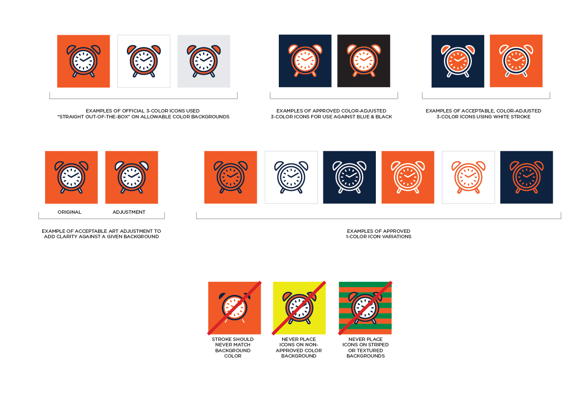
Approved Color Backgrounds
The icons in the UTSA Icon Library follow the approved UTSA Color Palette.
The icons feature:
- UTSA Blue (#0C2340) linework (strokes)
- UTSA Orange (#F15A22) accent fills
- UTSA White (#FFFFFF) fills

The icons are designed principally for use on the following backgrounds:
- UTSA White (#FFFFFF)
- UTSA Orange (#F15A22)
In print applications, such as RowdyZine, it is also acceptable to use the icons against a light tint (e.g. 10%) of UTSA Blue, Orange, or Black. In digital applications, it is also acceptable to use the icons against either solid red-orange ( #D3430D) or light cyan-blue ( #DBDEE3) backgrounds (the two latter colors are from the approved UTSA web extended color palette).
For instances where an icon needs to be used on top of UTSA Blue ( #0C2340) or UTSA Black ( #000000) backgrounds, create a new alternate version of the icon by simply swapping the blue and orange elements of the icon (leaving the orange elements intact), resulting in an icon featuring UTSA Orange linework (strokes) with UTSA Blue fills and UTSA White accent fills. (In rare cases where the extant icon was designed with no Blue fill color, simply swap the blue stroke color for white and leave the existing orange fill.) The SVG filetype is easily editable in Adobe Illustrator. Be sure not to change any of the other attributes of the design while editing the stroke and fill color values.
Note: Sometimes for aesthetic reasons it may be necessary to swap the two color fills for each other, or to choose white linework instead of orange.
Sometimes a design necessitates a 1-color icon. For these instances, create a new alternate version of the icon without any fills. The resultant linework may be colored either UTSA Blue ( #0C2340), UTSA Orange, ( #F15A22), UTSA White ( #FFFFFF) or UTSA Black ( #000000). The SVG filetype is easily editable in Adobe Illustrator. Be sure not to change any of the other attributes of the design while editing the icon.
Do not use the icons on top of patterned, striped, textured, or photographic backgrounds, nor on any non-UTSA-approved color background.
Learn more about UTSA’s approved color palette in the Visual Style Guide.
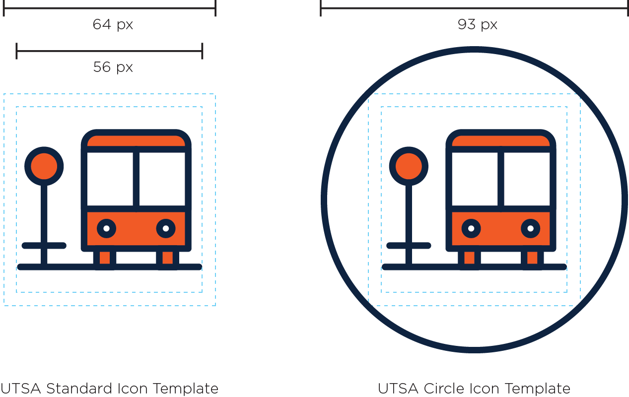
Icons Inside Container Shapes
If a design calls for icons placed inside container shapes, we recommend using a simple circle that matches the icon’s linework attributes. For those instances, create a new alternate version of the icon (at its original size) optically centered within a 93-pixel circle*. The circle container-shape may be filled with white in addition to being stroked, as long as other icons in the series are used consistently. The SVG filetype is easily editable in Adobe Illustrator. Be sure not to change any of the other attributes of the design while editing the icon.
Sizing of Icons
For most printed applications including brochures, magazines, and other collateral, scale the icon’s largest dimension to 0.375 inches (if the icon is inside of a circular container-shape, that icon+circle lockup should be scaled to 0.64 inches to maintain the same line weight). On rare occasions, if a smaller icon is needed (and provided that the linescreen of the printed piece is at least 150 DPI), the icon’s largest dimension may be reduced to 0.25 inches (if the icon is inside of a circular container-shape, that icon+circle lockup should be scaled to 0.437 inches to maintain the same line weight).
Remember to use scalable vector (PDF) icons for print applications.
For most on-screen (digital) applications including websites, kiosks, and mobile apps, scale the icon’s largest dimension to 80 pixels (if the icon is inside of a circular container-shape, that icon+circle lockup should be scaled to 138 pixels to maintain the same line weight). Generally icons shouldn’t be larger than 150 px, and shouldn’t be smaller than 50 px. Follow Apple, Android, and Google Play specifications for any icons being repurposed for mobile apps.
Icons are saved at 4x size. Remember to use scalable vector (SVG) icons anytime the icon gets enlarged beyond its 256px x 256px size (If a larger PNG is required, open and export the derivative PNG file using Export for Screens, choosing the appropriate width in the format column).
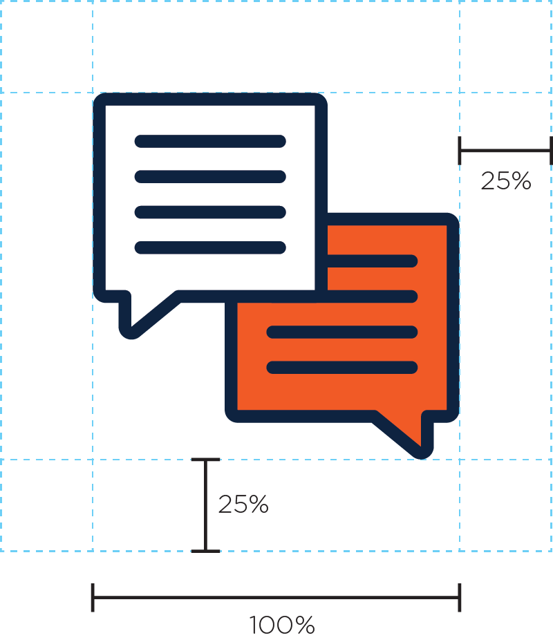
Maintaining Clear Space
It’s important to keep the area around the icons free and uncluttered with type or imagery so that other elements don’t compete with the icons. Maintain a minimum “keepaway” space of 25 percent of the icon’s largest dimension to separate it from other design elements.
Creating New Icons
There will be times when new icons are required. In those instances, make sure to work with designers familiar with the design guidelines and templates set forth in the Creating New Icons section, below.
Before adding a new icon into the Library, take time to look at the existing collection in case an appropriate symbol already exists: some icons can signify more than one referent. For example, a Conversation icon (two people sitting in chairs talking) may be appropriate to signify the UTSA English Language Center’s Coffee & Conversation program in one area of the website and also be equally appropriate to guide people to learn more about UTSA’s ITC Community Conversations in another.
As new icons are commissioned, take care to design any new icon in light of the whole collection. Look to see whether a particular element of the icon has been already introduced into the Icon Library. (For example, if a particular new icon has been requested that requires a calendar symbol, make sure to begin by copying one of the pre-existing calendar icons and then make adjustments from there, rather than introducing a new “competing” calendar symbol into the Library.)
Icon Attributes
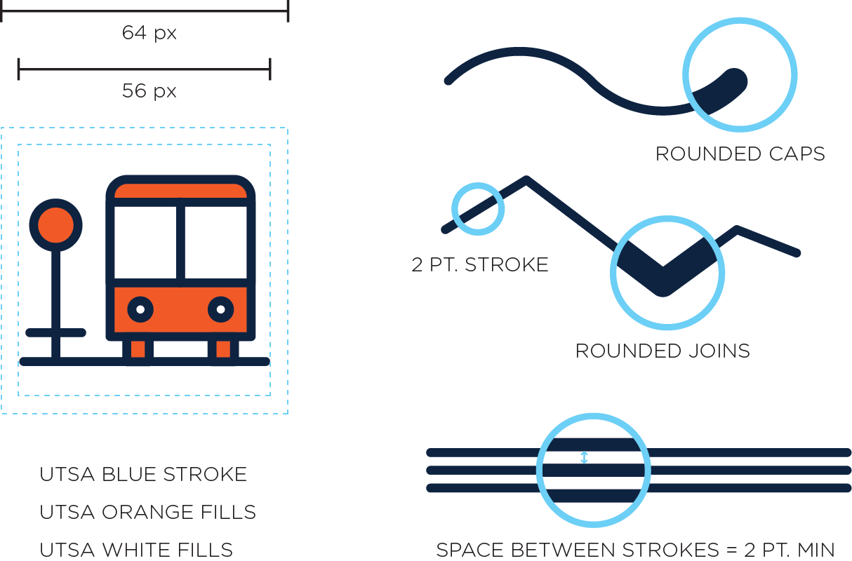
- Build new icons using the UTSA Standard Icon Template in Adobe Illustrator with the following attributes:
- 64px x 64px Canvas Size
- 56px x 56px Image Area
- 4px margin on all sides
- 2px line weights
- Ensure strokes have rounded caps and rounded joins
- Minimum space between strokes should be 2px whenever possible.
- Transparent background
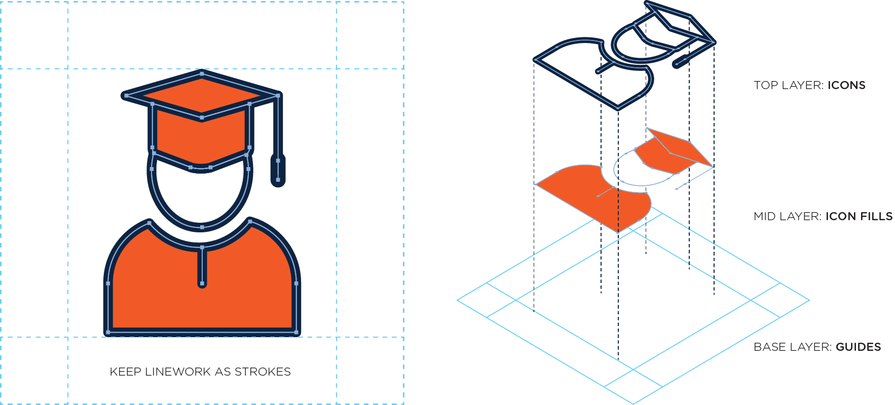
To allow maximum future editability, we strongly recommend:
- Keep strokes as vector paths (Do not Outline Stroke).
- Paste fills behind strokes rather than filling the stroke itself.
- Whenever possible, choose Align Stroke to Center.
Submitting Icons
We know that a variety of designers across the institution regularly use and create icons for UTSA. If you create an icon that may benefit the university at large, and if it adheres to these design guidelines, we would be happy to consider it for possible future inclusion in the UTSA Icon Library. Please contact Erin.Moring@utsa.edu to submit an icon.